

Camel Nuts undergoes massive brand overhaul after 46 years
share on
Camel Nuts, Singapore's nut manufacturing company, is undergoing a brand refresh after 46 years. Done in collaboration with brand consultancy KOUSAH&CO, the company underwent a complete strategic review of its business positioning and visual positioning.
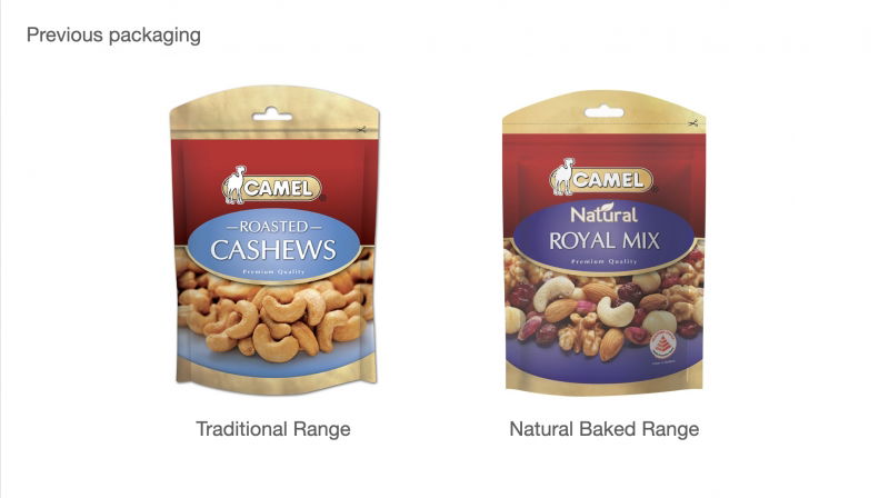
In a statement to MARKETING-INTERACTIVE, Emily Kousah, founder and CEO of KOUSAH&CO, said the brand refresh was prompted by a few factors: mounting competition, lack of brand loyalty with new consumers, and the brand's aging loyalist consumer base despite its desire to bring in a new generation of consumers. Camel also had a large portfolio with no clear extension strategy, and little differentiation between its roasted nuts and healthy baked nuts. According to Kousah, aside from the numerous small pack refreshes over the years, Camel has not updated its core identity since inception in 1974.
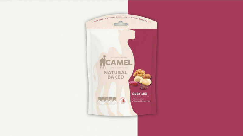
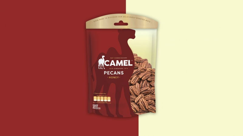
The brand refresh saw Camel redrawing its iconic camel icon and reviewing its font. The brand also introducing an "Established 1974" underline along with "nut connoisseurs" on its new packaging. The brand has currently launched two products with the refreshed brand identity: its Ruby Mix under its natural baked selection, as well as its honey pecans. The new packaging for Camel is now available in stores as well as its online retail site.
KOUSAH&CO took a three-step process for the brand refresh: strategy, creative, and support. It first held a full review of the Camel's brand today, looking at its competitors, stakeholder interviews, positioning, brand DNA, portfolio architecture. The agency then had a two-day workshop with the brand to work through the findings and craft the brand blueprint and creative brief.
Next it explored a range of routes for the brand and packaging, all looking at how it could evolve the branding to be more of today without alienating loyalists, as well as setting up a packaging architecture to create a stronger and more confident branded presence on shelf. The agency then continued to refine the chosen direction, redrawing the camel icon, reviewing typeface, introducing the "Established 1974" underline along with "nut connoisseurs" and tackling the full brand packaging strategy across a number of ranges and products. After that, it captured the full brand world and principles for application on and off pack in a comprehensive set of guidelines.
Moving on, the agency will continue to support the team at Camel as it tackles the implementation. It will also be providing brand guardianship and creative direction to Camel's internal team.
Kousah told MARKETING-INTERACTIVE that much of the rebrand is done in-house with the help of a small artwork house. Although unable to reveal how much was spent on the brand refresh, she revealed that it was done on a tight budget. “Our founding model is built on flexible teams created to best suit the challenge. For the Camel project we built a team with collaborators in Singapore, Australia, UK and Canada, all with strong expertise in FMCG branding and packaging," Kousah added.
“Through a collaborative approach with the core team, we helped cement the Camel Nuts offer into a clear brand blueprint which informed our positioning strategy and creative brief. With a heritage brand such as this it was paramount that we were able to bridge the gap between traditional consumers and new and find a way to stand out more proudly in an increasingly competitive environment," Kousah said. She added that the new brand identity and visual brand world also allowed the brand to evolve key core product range favourites while not alienating its loyal consumer base. It also helps the brand bring a fresher, more modern and natural feel to its newer, healthier product ranges.
Camel's refresh comes as the brand was recently awarded the "Made with Passion" brand mark, along with 47 other local brands. The brand mark was created to tell the passion stories behind each local brands, and to encourage other local brands and aspiring entrepreneurs to follow suit and tell their own passion stories. According to the Singapore Brand Office, carrying this brand mark allows brands to signify their strong connection to Singapore and their unwavering passion.
Related Articles:
Julie's Biscuits refreshes brand logo after 35 years to 'make biscuits young again'
EZ-link taps Superunion for modern new look and brand refresh
LiHO's lion mascot gets a new haircut as it unveils new logo
share on

Free newsletter
Get the daily lowdown on Asia's top marketing stories.
We break down the big and messy topics of the day so you're updated on the most important developments in Asia's marketing development – for free.
subscribe now open in new window