
EZ-link taps Superunion for modern new look and brand refresh
share on
Contactless payment company EZ-Link has refreshed its branding after reviewing the system and architecture of its products and services. According to a press release, the new brand centres around the idea “For life’s little wins” to underscore the brand’s mission of eliminating hassle and enabling possibilities for customers in the little moments across their daily lives.
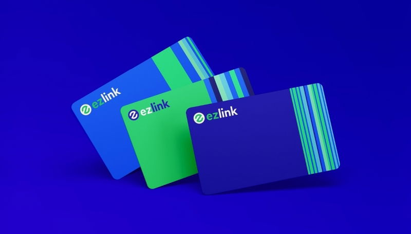
Done in collaboration with branding agency Superunion, EZ-Link’s rebrand includes a new logo (picture below right), as well as a refreshed corporate website and EZ-Link app. This new visual identity reflects the company’s renewed focus on digital transformation, while still maintaining key elements that have become strongly associated with the brand. According to Superunion, there is also a new graphic system of dynamic celebratory stripes, which provides a simple representation of EZ-Link rewards as they are accumulated and redeemed.


Moving forward, new and existing products of EZ-Link will now be housed under three sub-brands: EZ-Link Motoring, EZ-Link Rewards and EZ-Link Wallet. Each sub-brand provides a specific type of product or service offering, allowing for better consumer navigation and focused areas of innovation. MARKETING-INTERACTIVE has reached out for additional information.
To kick off this brand refresh, EZ-Link has unveiled its enhanced mobile EZ-Link Wallet designed to bring greater convenience and rewards to users. Aligned with Singapore’s Smart Nation aspirations, this move is part of EZ-Link’s ongoing strategy of building its ecosystem of digital services to better serve consumers in their daily lives.
Nicholas Lee, CEO of EZ-Link, said the company looks to put people at the heart of its innovation as it pushes forward in its digitalisation journey. “This is in line with our new brand direction, which is rooted in the belief that our everyday life is lived in small moments that can be turned into little wins. Whether it’s providing added convenience to consumers through mobile EZ-Link card top-ups, or letting them redeem their favourite bubble teas on our Rewards platform, we can leverage technology to enhance their everyday tasks, and help them enjoy the little wins,” he added.
Scott Lambert, creative director of Superunion Singapore, added that the new visual system allows the brand to expand its role in the lives of Singaporeans, and is the result of a “rewarding and collaborative” partnership with the EZ-Link team.
The brand refresh comes after EZ-Link picked Superunion to develop a refreshed brand strategy, visual identity and positioning in September last year. The new look is said to better reflect the brand’s personality and connect more meaningfully with consumers. Superunion was selected based on its strong record of collaborating with organisations in a state of transformation. This comes as the company recognises that the agency not only has "strong experience" working with several local companies such as SGX, FairPrice and Carousell, but also focuses on upstream strategic and creative thinking. As such, it was "best placed" to offer the EZ-Link brand renewed meaning for its for its next wave of mobility solutions in Singapore and beyond.
EZ-Link is not the only brand to go through a brand refresh in this month. Earlier in this month, bubble tea brand LiHO Singapore and biscuit brand Julie's Biscuits also went through rebranding, adopting new logos. LiHO's mascot received a "hair cut", with its wavy lion mane turned into a neat circle to welcome the new year, while Julie's Biscuits gave its iconic girl in its logo a younger look. In the new logo, Julie has short hair and wears a hairband with a red ribbon at the top, as well as a blue outfit. She is looking forward and upwards in the new logo and according to the brand's corporate identity guide, Julie takes on "a spirit of hope and confidence".
Related Articles:
EZ-Link picks Superunion to reposition itself as more than just a card
Touch ‘n Go and EZ-Link to develop Combi Card for urban mobility in MY and SG
LiHO's lion mascot gets a new haircut as it unveils new logo
Julie's Biscuits refreshes brand logo after 35 years to 'make biscuits young again'
share on

Free newsletter
Get the daily lowdown on Asia's top marketing stories.
We break down the big and messy topics of the day so you're updated on the most important developments in Asia's marketing development – for free.
subscribe now open in new window