


Julie's Biscuits refreshes brand logo after 35 years to 'make biscuits young again'
share on
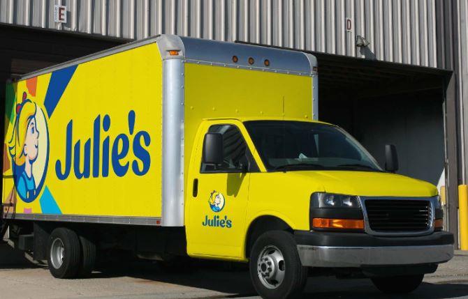
Julie's Biscuits has refreshed its brand logo more than 35 years after it was founded in 1984, giving it a younger look. Director Tzy Horng Sai said in its corporate identity guide that it was time for a makeover to "express who we are and what we stand for". In the new logo (pictured right), Julie has short hair and wears a hairband with a red ribbon at the top, as well as a blue outfit. She is looking forward and upwards in the new logo and according to the brand's corporate identity guide, Julie takes on "a spirit of hope and confidence". Despite the brand refresh, Julie is still the same girl, as evident from her blonde hair and splash of red. The brand's primary colours - yellow and blue - are also prominent in the new logo.
This time round, the wordmark "Julie's" is in blue and the company explained that the wordmark supports her "with its confident, friendly lines that pay homage to the brand's heritage typeface". It also described Julie to be a symbol of what it is - cheerful, evergreen, welcoming and hopeful. The brand added that her "distinctive cheerful and infectious optimism" is still core to its brand and has driven its refreshed identity.
On the other hand, the previous logo (pictured left) featured a seemingly older-looking Julie with two pony tails and blue ribbons. She also donned a blue shirt and a red vest, and the wordmark was yellow in colour.
In a statement to MARKETING-INTERACTIVE, Sai said Julie's spent close to SG$1 million for the entire project and worked with Superunion for the global rebrand. It called for a pitch at the end of 2017 and mid-2018 was when the actual work began. Hence, the rebranding took about one and a half years. The new branding was rolled out in Malaysia and Singapore first, since they are both considered home markets. Meanwhile, Sai said the rebranding for export markets will roll out early next year.
"We wanted to make biscuits young again and capture the hearts of the younger audience because we felt that biscuits have become a thing of the older generation. We also wanted to be an aspirational brand, something that can make consumers happy the moment they see us after waking up. We hope the brand icon will inspire hope and make consumers look forward to the day," he added.
According to Sai, the process of converting all assets was rigorous because the brand had numerous SKUs, stakeholders, as well as different markets and considerations. "We went through an intensive research process that was three-pronged. Pre-branding, we cleaned up our portfolio and analysed the type of existing brand assets we already had. We also made sure that in the process of transformation, we do not forsake or shortchange ourselves," he added.
Julie's also spoke to consumer focus groups to see if the potential designs they were working on resonated with them. Sai said: "It was a very comprehensive process, we didn't rush it because we wanted to make sure this worked for everyone."
Ambrish Chaudhry, managing strategy director, Superunion, said: “Originating from Malacca, Julie’s is testament that a genuine commitment to quality can transcend borders. We wanted the Julie’s brand and the girl to be an embodiment of that attitude; using biscuits as a small and simple way to connect with each other, giving the category more credence for a younger population looking for other alternatives." He also added that the visual identity system and tone of voice is meant to capture the optimism and wholesomeness the team at Superunion encountered in every Julie’s employee it came across.
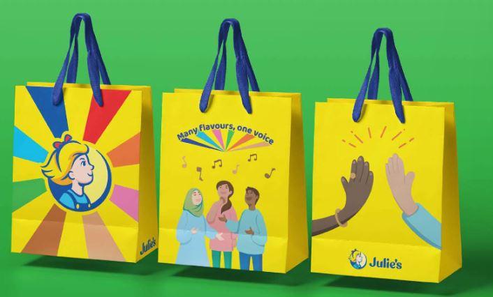
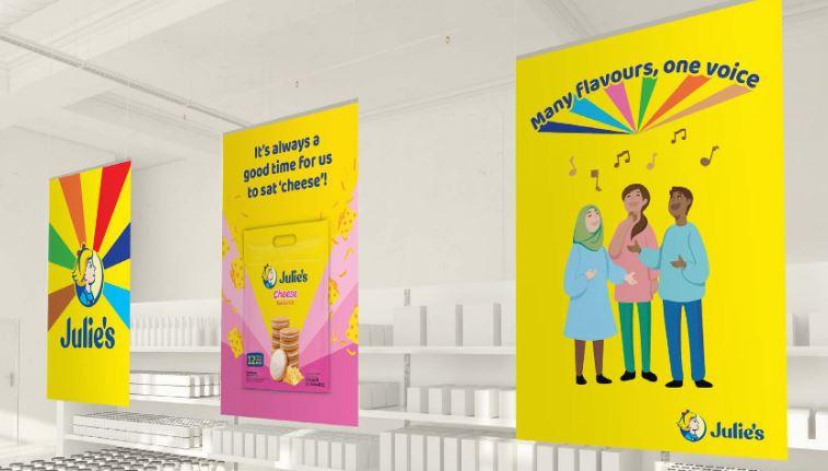
Julie's uses Baloo Bhaina 2 (extra bold) for its headline font as it is able to visually express the brand's personality. For the body copy and informational text, Nunito is used. Meanwhile, the Chinese typeface for its body copy and information text is Noto Sans. The Julie's ray is also used in its brand assets and according to the corporate identity guide, the ray is described as "a strong graphic device and represents joy emitting out of [the] brand". It is also a visual representation of how Julie's bridges the world, the brand added.
When it comes to photography, some of the key words it relies on to draw inspiration are people together, hopeful, optimistic, delightful and delicious. Julie's illustration style also features soft lines with a two-tone colouring inspired by the tones of the Julie's girl icon. The guide also listed humble, open, fearless and irreverant as the unique personality traits that are central to the brand expression.
According to Sai, one of the things COVID-19 has forced Julie's to do is "to get much more serious about digital". As such, the company plans to double down in that area. While Julie's exports to 80 different countries, the company will focus its efforts on the top 10 countries in 2021, including Malaysia, Singapore, Indochina and China. "Moving forward, we want to be much more consumer-centric and leverage on digital to gain more consumer insights and bring the brand closer to consumers," Sai said.
In addition to new logo, Julie's also refreshed the way it classified its portfolio, grouping its range of biscuits under seven core pillars - sandwich, OAT25, Le-mond, crackers, decadent, love letters and assorted. "Each one is a mini family of biscuits that share unique design expressions, while still feeling part of the wider family. We want our consumers to find more of what they love more easily, more conveniently and at any time of day," it added in the guide.
Photo courtesy: Julie's corporate identity guide
Enjoyed what you have read? Follow us on Instagram for the latest updates in Southeast Asia's marketing and advertising space!
Related articles:
GOVT Singapore helps biscuit brand Julie's resonate with China market
share on

Free newsletter
Get the daily lowdown on Asia's top marketing stories.
We break down the big and messy topics of the day so you're updated on the most important developments in Asia's marketing development – for free.
subscribe now open in new window