

5 ways to do mobile websites right
share on
Mobile commerce has grown phenomenally over the past years within all industries. As such, having a well-designed, easy to use mobile website has become extremely important. In order to help you determine the best approach to handling your mobile website, we’ve put together an outline of some considerations you’ll need to bear in mind:
- Think with your finger
- Keep the design simple
- Keep only relevant content
- Keep the functionalities simple
- Focus on your customer need
Let’s take a look at five examples of mobile sites that we feel are great examples of these:
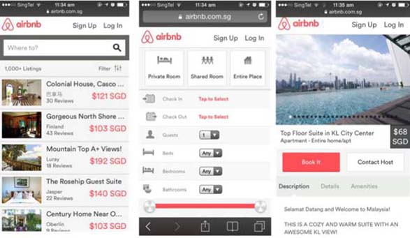
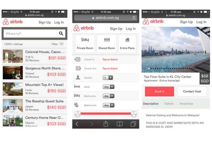
AirBnb
- The design is clean and fairly simple.
- The search functions are easy to use: The search bar is obvious and there are essentials filters.
- The checkout process is simple, with less than five clicks.
Foodpanda
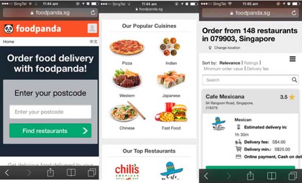
What we love:
- The geo-localisation function is perfect for a food delivery website.
- The choice on the homepage: If you don’t know what to eat (which is the case 70% of the time) - you are automatically shown popular cuisines and top restaurants in your areas!
- Like Airbnb, they make use of filters well, so it’s easy to find what you want.
Emirates
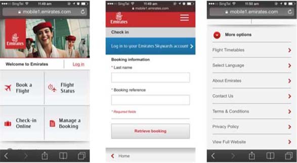
What we love:
- You are shown the most relevant information on the homepage: Book a flight, flight status, check-in online and manage a booking. Nothing more, only what's essential.
ASOS
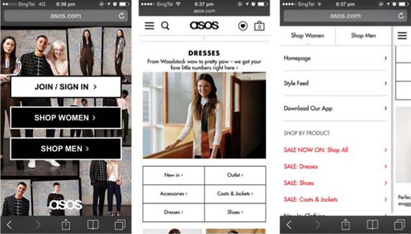
What we love:
- On the first page you choose between: Sign-in, women’s shop or men’s shop. Therefore, you will get only the products you are most likely looking for.
- The menu on page 2 portrays the most popular categories. You directly have access to the best categories without having to look further.
- The obvious wish list button on the header.
- The left menu where you can switch from women’s shop to men’s and also directly access all on-going sales,
Nastygal
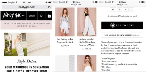
What we love:
- The consistency between desktop and mobile versions.
- Simple and clear top menu navigation (Shop, Search bar and cart) which are the key features.
- Excellent product listings with large images.
- Great combination of typography selections between serif and san serif.
- Free Shipping information on top navigation bar and a product page urging customer to shop more.
The writers are Enny Hartati, head of design & Souad-Marie Assaad, head of product at Luxola.
For more perspectives on customer experience management and UX design from brands such as Kimberly-Clark, Subway and Toys “R” Us, look out for Marketing magazine’s Customer Experience 2015conference, happening 11 – 12 March 2015.
To register, please click here or contact Carlo Reston at carlor@marketing-interactive.com or call +65 6423 0329, +65 9727 0291
If you would like to learn more about sponsorship opportunities, contact Soren Beaulieu atsorenb@marketing-interactive.com or call +65 6423 0329.
For speaker or agenda queries, please contact Ambrish Bandalkul at ambrishb@marketing-interactive.com or call +65 6423 0329.
share on

Free newsletter
Get the daily lowdown on Asia's top marketing stories.
We break down the big and messy topics of the day so you're updated on the most important developments in Asia's marketing development – for free.
subscribe now open in new window