


Xiaomi adopts new logo. Can you spot the change?
share on
Xiaomi has unveiled its new logo which is said to disrupt the traditional rules of brand logo usage of the past. The new logo adopts a softer, rounder contour on the corners of the previously squared logo, along with redesigned “MI” typography.
Its iconic brand colour orange remains to convey the liveliness and youthfulness of Xiaomi. Black and silver will also be used as supplemental colors to accommodate high-end product line applications. According to the brand, the new logo is not fixed at the four corners of the square, instead, it adapts to content and is placed at the most suitable position. The new dynamic logo further embraces the philosophical thinking, making the logo truly come “Alive”.
![]()
The rebranding and "Alive" concept was done in collaboration with world-renowned designer, professor of Musashino Art University and the President of the Nippon Design Center, Kenya Hara. Xiaomi explained in a blog post that Hara used “superellipse” mathematical formula when designing the logo of Xiaomi.
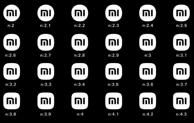
"While there are infinite options between a square and a perfect circle, the designer achieved a visually optimal dynamic balance by adjusting the variables in the formula. Using n=3 struck the perfect balance between a square and a circle, epitomising the core aspect of 'Alive', resulting in the brand new Xiaomi logo," the brand explained.
Compared with a right-angled object, Xiaomi said a circle is a shape that is more agile, which is the perfect representation of the company's flexibility, relentlessness and its will to move forward. The new logo was unveiled during its new product launch session which was also live-streamed on Facebook.
Meanwhile, Hara explained in a separate video that through experimenting with the curve of the typography, the team arrived at a perfect font - synched with the logomark outline. It also completely redesigned the logotype to match the new look. "Using the logomark and the logotype separately is optimal. When promoting brand and services, we suggest using the logomark. The logotype, on the other hand, will look its best on Xiaomi's high-resolution devices," he added.
https://www.facebook.com/XiaomiGlobal/videos/2546536225650678/
After unveiling the new logo, founder, chairman and CEO Lei Jun asked the audience during the launch: "Are you disappointed at this logo? We just made our original logo rounder." He added: "This time, the designer told me that he did not just change the shape from square to round, actually, the internal spirit as well as the mentality of the brand will be changed."
The concept of "Alive" is Xiaomi's response to the era of intelligent interconnectivity, as it aims to bring more innovations around the world and grow along with its users. While the logo might not seem like a huge change, Xiaomi said the "Alive" concept proposed by Hara interprets Xiaomi’s philosophy from a visual perspective, giving the brand a visual image full of life. "People are alive – technology is created by people – technology, thus, is also alive. Technology will always serve the needs of life," it explained. MARKETING-INTERACTIVE has reached out to Xiaomi for additional information.
Just yesterday, Lei announced a series of key initiatives for the new decade, one of them being the commencement of its smart electric vehicle business. According to him, this is one of the most important decisions Xiaomi has ever made and it plans to create a wholly-owned subsidiary to operate the smart electric vehicle business, investing up to US$10 billion over the next 10 years.
At the same time, it also launched the Surge C1 Image Signal Processor to showcase its capabilities in the imaging field. On the smartphone front, it also recently launched the Mi MIX FOLD which adopts a U-shaped hinge design.
MARKETING-INTERACTIVE's Content 360 Week is back from 6 to 8 April this year! Super charge your content production, distribution and monetisation strategies by learning from brands such as NBA Asia, P&G, Malaysia Airlines, and Marriott International, among others. Sign up today!
Photo courtesy: Xiaomi's Facebook Live session
Related articles:
Popeyes SG 'deep fries' Apple while Xiaomi thinks out of the box
Tourism Malaysia partners Xiaomi to further boost Visit Malaysia 2020 initiative
Xiaomi apologises for copying artist work for LG, dismisses employee responsible
share on

Free newsletter
Get the daily lowdown on Asia's top marketing stories.
We break down the big and messy topics of the day so you're updated on the most important developments in Asia's marketing development – for free.
subscribe now open in new window