


Pantone's 2020 Colour of the Year is 'calming' and 'resilient'
share on
It seems like we might get a calming start to 2020 as PANTONE recently announced that the Colour of the Year for 2020 is PANTONE 19-4052 Classic Blue. If the numbers don't make sense to you, try imagining the colour of the sky at dusk (or just look at the picture above). According to PANTONE, the colour instills calm, confidence and connection, and highlights its desire for "a dependable and stable foundation on which to build as consumers cross into a new era". A timeless and enduring blue hue, PANTONE 19-4052 Classic Blue is elegant in its simplicity. The restful colour brings a sense of peace and tranquility to the human spirit, offering refuge.
Aiding concentration and bringing laser like clarity, PANTONE 19-4052 Classic Blue re-centres our thoughts. A reflective blue tone, Classic Blue fosters resilience.
PANTONE added that the new colour is "non-aggressive and easily relatable" and lends itself to "relaxed interaction". "As technology continues to race ahead of the human ability to process it all, it is easy to understand why we gravitate to colors that are honest and offer the promise of protection. Associated with the return of another day, this universal favorite is comfortably embraced," PANTONE added.
To arrive at the Colour of the Year selection each year, PANTONE's colour experts at the Pantone Color Institute comb the world looking for new colour influences. This can include the entertainment industry and films in production, travelling art collections and new artists, fashion, all areas of design, popular travel destinations, as well as new lifestyles, playstyles, and socio-economic conditions. Influences may also stem from new technologies, materials, textures, and effects that impact color, relevant social media platforms and even upcoming sporting events that capture worldwide attention. Check out the previous Colours of the Year here: 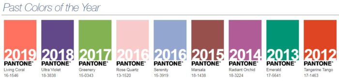 Separately, Shutterstock also recently unveiled its top three colours for 2020. Contrary to PANTONE's calming blue, Shutterstock's colour palette boasts bold, saturated hues - Lush Lava, Aqua Menthe, and Phantom Blue. The company added that 2020 will see a shift from soft pastel colours to more sensational shades. Calming or bold - which do you prefer? I'm all for one that captures attention!
share on

Free newsletter
Get the daily lowdown on Asia's top marketing stories.
We break down the big and messy topics of the day so you're updated on the most important developments in Asia's marketing development – for free.
subscribe now open in new window