


GOJEK revamps logo, shares insights to new look and creative challenges
share on
GOJEK has unveiled a new visual identity, swapping the Ojek (bike taxis in Bahasa Indonesia) logomark for “Solv”, a nearly-rounded ring encircling a dot. The rebrand seeks to reflect the company’s evolution “from a Jakarta-based ride-hailing service to Southeast Asia’s leading Super App”, said a press release.
It follows after the company recorded 1,100% growth in transactions on its platform over the last three years, from June 2016 to June 2019, on increased demand for GOJEK’s integrated services. According to the company, the rebrand sets the course for its next phase of growth, which will include further innovation and the strengthening of its integrated ecosystem of over 20 on-demand services.
GOJEK Group co-founder Kevin Aluwi said: “GOJEK is now many things to many people – and our new logo reflects that. Even so, we remain committed to our founding principle and ethos of improving people’s lives through the use of technology.”
The rebrand has begun rolling out to users in Indonesia and Singapore. Consumers who update their app will be able to see the new logo in place and a new user interface, which includes a fresh palette of colours and fonts. The app for driver-partners will also soon be updated with the new look, in addition to a number of new features, such as a seven-day income summary that gives them a clear overview of their completed trips in the past week.
GOJEK group president Andre Soelistyo added: “We look forward to the next chapter of our growth, not only in Indonesia – where we have the highest number of monthly active users compared to other on-demand platforms – but across the other Southeast Asian markets that we have expanded to over the past year.”
Solving creative challenges
The new logo, according to a post on GOJEK’s engineering blog, can be interpreted in a number of ways. The new logo bears resemblance to a power button, which identifies with its mission to empower people to live a hassle-free life; a search icon symbolising the search function on GOJEK; a map pin to represent how the company is there for consumers no matter where they are; and a top-down view of a GOJEK driver, which serves as a tribute to the ‘heroes’ behind the wheel.
Explaining the rationale for the change, GOJEK said its brand language has remained the same throughout the company’s growth and changes since 2015, causing many creative challenges. It explained:
We struggled in more ways than one.
“Our logo was hard to see at small sizes. It wasn’t flexible enough, and its complex shape made it hard to recreate in different materials, basically very easy to mess up.”
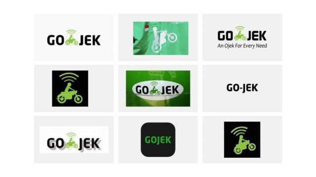
The old logo, which precedes its app, was a marriage between an Ojek (bike taxis in Bahasa Indonesia) and technology (symbolised by the wifi symbol atop). However, the company realised that the integration of meaning in its logo may also put “an expiry date” on it. “While Gojek started with and still continues to be an online ride-hailing app, our mission has extended far wider today. And our logo, iconic as it was, would sometimes get in the way,” it said.
With more than 19 products and services, GOJEK described itself as “an app of apps, a SuperApp”. In Indonesia, GOJEK has built three “Super Apps”, one each for consumers, driver-partners, and merchant partners. Each app provides its respective users with services and features designed to make life better and help them to excel.
Running out of colours to attribute to new products, the company identified a need to rethink its brand architecture into something that that would accommodate all its sub-brands and “have room to spare” for its other offerings in the future. Additionally, it said:
Our typeface looked dated, and struggled to provide enough variety with its limited range of weights. So did the illustration style, the tone of voice, and everything else.
After months of research, according to the blog post, the team arrived at a “symbol of solutions” nicknamed “Solv”. “It was unique enough to stand out from the competition, memorable enough for anyone to redraw from memory, and still flexible enough to work at any size, anywhere,” said GOJEK.
Its product offerings are also categorised to six colours, namely transport and logistics (green), food and retail (red), payments (blue), news and entertainment (pink), daily needs (orange), and business (purple).
share on

Free newsletter
Get the daily lowdown on Asia's top marketing stories.
We break down the big and messy topics of the day so you're updated on the most important developments in Asia's marketing development – for free.
subscribe now open in new window