Pepsi brings back 1990s look in major logo revamp after 14 years
share on
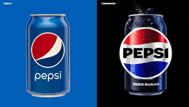
Pepsi has unveiled its new logo and visual identity which makes it the first update of the Pepsi globe logo in 14 years. Rolling out the new look in North America later this year, in time for the brand's 125th anniversary, Pepsi will be introducing it to the rest of the world in 2024.
According to Pepsi, the new logo and visual identity pays homage to the brand's heritage while being forward looking in terms of sustainability. Reminiscent of the 1990s version of the logo, which according to Pepsi’s chief marketing officer, Todd Kaplan, has made an impression with consumers and stuck, the new logo is modernised and bolder with a different font and font colour as well as a new border. While the previous font had a lower-case Pepsi sitting shyly next to the globe with a pastel blue background.
Kaplan said that Pepsi is a “bold and confident brand” that stands for “unapologetic enjoyment” this was unfortunately not being delivered by the brand’s current logo and as such in need of a change. He went on to add that the new visual system brings out the best of the Pepsi brand's rich heritage, while taking a giant leap forward to set it up for success in an increasingly digital world.
Along with the updated colour palette and modern, custom typeface, the new design also includes the signature Pepsi pulse, which evokes the “ripple, pop and fizz” of Pepsi-Cola with movement, he explained.

Don't miss: Nokia's sleek new logo: Let's hope it isn't going to be an issue like it was for KIA
"We couldn't be more excited to begin a new era for Pepsi, as this exciting new and modern look will drive brand distinction to show up bigger and bolder and help people find new ways to unapologetically enjoy the things they love,” Kaplan said.
Mauro Porcini, chief design officer of PepsiCo said that the new brand identity was mainly designed to connect with future generations with the brand’s heritage by “marrying distinction from our history with contemporary elements to signal our bold vision with what is to come.”
He added that in an increasingly digital world, the revitalised and distinct design hopes to introduce more movement and animation into the visual system, unlocking more flexibility for Pepsi to move between physical and digital spaces. Especially in the age of the metaverse, brand identities need to be agile in moving from retail shelves to the metaverse to maintain its relevance.
Meanwhile, Pepsi has also upped its marketing antics. Following the celebrated debut of the Pepsi Zero Sugar "Great Acting or Great Taste?" campaign during Super Bowl, Pepsi has made fictitious character Derek Zoolander as its new face.
Don't miss: Pepsi partners with actress Lindsay Lohan to promote #PilkandCookies challenge
As part of the campaign, Zoolander is asking cola drinkers to taste Pepsi Zero Sugar and decide for themselves if the new and improved Pepsi Zero Sugar is actually “really really” ridiculously good tasting, or just a result of Zoolander’s one-of-a-kind modeling slash acting.
Related articles:
Pepsi brings back iconic 2000's character Derek Zoolander as new face
PepsiCo pledges to double zero-waste packaging by 2030
Pepsi partners with actress Lindsay Lohan to promote #PilkandCookies challenge
share on
Free newsletter
Get the daily lowdown on Asia's top marketing stories.
We break down the big and messy topics of the day so you're updated on the most important developments in Asia's marketing development – for free.
subscribe now open in new window
